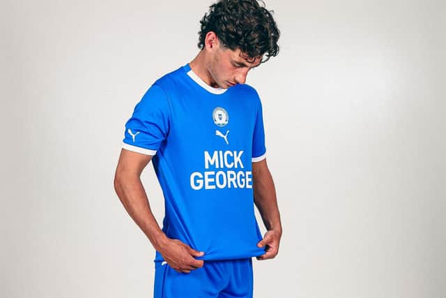
'It looks like something you'd get with a Happy Meal' & 'They could play in a binbag for all I care as long as they win,' - Peterborough United fans react to new home shirt.
and live on Freeview channel 276
The Puma-manufactured shirt drew criticism for it’s central badge and its large sponsor logoa, although Posh had little input into the badge positions
‘Like something you’d get with a Happy Meal,’ said one fan.
‘£50 for a pyjama top?’ said another.


But at least it was in the club’s traditional blue colours!
All comments to @PTAlanSwann on Twitter…
Last season’s mint green and this year's pink number are nice. But I won't be purchasing as for the money I'd want an embroidered badge and better quality. Nike were a touch bland granted, but at least they felt like they'd last more than 3 washes – @Jinksy6
Advertisement
Hide AdAdvertisement
Hide Ad£50 for something that looks like a pyjama top? – @robhamblin
Can we play this year in the training kit? It’s absolutely stunning! Not feeling the home kit at all but the away kit is beautiful. Puma and the badge is the wrong way round imo – @lukejuanpywell
Such a shame seen so many decent designs from puma for other times and compared to previous years this one is dreadful – @14obrien141
2/10 they got the colour right – @craigDLyons
Didn’t think it was possible to make something so bland look even worse, minimal creative effort – @PUFCChris
Advertisement
Hide AdAdvertisement
Hide AdPrefer a darker blue personally! Would get the training shirt if it didn't have the sponsor on the front of it so will stick with the COVID promotion season shirt and pizza shirt for now! Nicest shirt is the black shirt but they only stocked a handful and never replenished! – @davidwh1971.
Awful. Looks like it comes free with a happy meal – @ABilboroFC
I really like the central badge – @zaknumber1
It’s made me dislike puma kits even more. Horrendous – @CriagIsted
I like it – @JessicaaAC
If badge was in usual place it would be ok, but central badge ruins it. Not for me. Two average kits so far. Hope third shirt rescues it. Will end up getting the training shirt thats the best thing we have at the moment – @TartanSimmo14
Central badge awful. £50 for a t shirt! – @alanposh
Advertisement
Hide AdAdvertisement
Hide AdI was dreading it after seeing the awful away kit, but it’s ok – @poshpanther
Don’t hate it but don’t love it, it’s almost a bit too basic. Like the centralised logo/badge though – @nathan_young92
Awful. Time to boot Puma out – @pboromikky
I can’t justify dropping £50 on a stick-on badge. Been several years since I’ve bought a kit now. With a slightly bigger, embroidered badge and a black-bordered sponsor, this would have been an instant purchase – @HarryAnders272
Looks plain but nice, i think everyone’s overreacting a bit, maybe not used to seeing a central badge – @joshowen15
Just…awful. Send it back – @Eamonnduff
Advertisement
Hide AdAdvertisement
Hide AdThey could play in a binbag for all I care as long as they win, but as an overweight 50+, I don't think I'm the target market! – @Skydank1
Looks like a baby grow you buy for a new born 1/10 (1 for the colour) – @RRMorleyy
Shirt itself is nice, clean, classy. I like the white collar and cuffs. Not a big fan of central badges, but that’s just personal taste. Reckon this is one that will look better on players (i.e. properly fitted) than on us fans though! – @TheKittMatt
Really disappointed for 2nd year running. Too plain, I miss the white sleeves, would even like a season in the sky blue and white stripes again – @BuckRodgersPosh
So basic and lazy, when are we gonna put some effort into making our kits stand out? – @beardie194
It's the best looking shirt for a good few years – @MattAll82111727