
Peterborough United new crest: All you need to know about why the club is exploring a rebrand
Peterborough United have embarked on an 18-month brand evolution project.
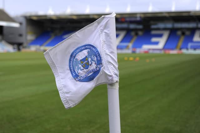
Much has already been said about the proposed new brand evolution, part of which could see the club’s current crest changed.
The Peterborough Telegraph has attended a briefing with the club’s Head of Media and Marketing Clive Edwards and designer Chris Payne.
Below are a summary of the reasons given for exploring the new project. The club has split them into five defined headings.

All quoted words are those of Clive Edwards.
KEY FACTS
- Supporters to be given a ‘massive’ say in what the brand looks like. This has not been decided yet.
- Owner Darragh MacAnthony to have final say over if project is implemented.
- Fans have until around the end of the month to fill out the survey. Closing date to be communicated.
- Over 1200 responses from fans have been received so far.
- Designer Chris Payne will present six designs to the club, this will be whittled down in a process yet to be decided.
- If ownership sign off is given, the crest could be seen on kits in the 2026/27 season. For this, final sign-off would need to be given by the end of October.
Improve the usability and functionality of the crest across brands and digital platforms
Our current crest doesn’t work for us logistically. It was created because Adidas couldn’t print the old crest.
We have multiple challenges from a retail point of view creating products using that crest and in manufacturing them.
If you look around the ground, the crest is printed differently in various places, different colours, different ways designers and printers have cut it out because it’s incredibly detailed, compared to modern crests.
Digitally, we have massive challenges with being recognised, especially when the badge is shrunk down to a small size, as it appears on social media or online often. We are looking at digital-first/modernisation. When you see our crest on apps or video games, it’s not necessarily as identifiable as we’d want it to be.
Develop a suite of identities to tell a story for supporters new and old
We want to create a crest/suite of identities that tell our story in a passionate and exciting way. I’m not sure we’ve achieve that with the current badge yet.
The existing crest is based around the city’s coat of arms- it is not unique to us. It tells the story of Peterborough, which is really important, but it doesn’t tell our story. We want to be our own entity within that community
We’re looking to achieve a brand, crest, sub set of typography and identities that tells our story. History and tradition will be at the forefront of what we’re going to do.
Create a brand that aligns with club goals and represents the club as its own entity
We want to create a brand that aligns with our goals today to be a progressive and inclusive club. It is about create a young dynamic team that is successful on the pitch. There are other elements that the generic city badge does not tell the story of.
The current would be considered traditional, but not unique to Peterborough United. It could be looked at having a religious connotation to an individual religion rather than being inclusive to all. There is a number of ways in which different people could perceive that badge.
It’s about more than the crest too, it’s about creating a brand, telling stories and celebrating who we are. It’s a celebration of Peterborough United and of the city and our history. What we want to achieve is a celebration of Peterborough United, a celebration of the city and a celebration of our history.
Align all existing brands to create continuity
We have a number of sub-brands, such as Posh+, Posh Awards, Junior Posh, Peter Burrow- they have all been created at different times and different designers for different motivations.
Part of the project, which hasn’t necessarily been communicated yet, is that we will be rebranding all of those as well. They will all have a coherent way in which they are presented.
There is a lot of disconnect currently about what our foundation and our academy sides etc do. There no continuity in brand and there’s similar issues with the women’s team.
The mission is to be one club, one community and this is a very small part of helping to create that.
Take the typography around all of the stadium as well- it’s different everywhere. Take all of the crests around the stadium, they’re presented in different ways. It’s not modern and it’s not progressive- it’s not where we want to be.
This is more than aesthetics only project. I’m here to tell a story, from a branding and crest point of view, we are not doing that justice currently.
Develop new revenue streams
“We are not afraid to say either that we are trying to develop new revenue streams and commercial opportunities that currently don’t exist. These can be helped by this evolution but it is not a silver bullet. No one is saying that if the project goes ahead and is successful then there will be new opportunities opened up financially.
“We are looking at the value of the club, how it is perceived by other clubs, in terms of its progressiveness those avenues are all valuable.
Are the club going to ‘just do this anyway?’
There’s an argument we could have held a fans forum earlier but we had a limited amount of time, we only have Chris over from the States for a small window.
There is a clear case for why we’re doing this. No one here is saying that if something we all don’t like was created then we would adopt it because of the case.
We really want to educate people about the case for doing this, then we move forward to the next discussion, which is what he should do, how we should do, what it should look like. That is so undecided.
It feels as if there is a view that that this is already decided and categorically, a pencil has not been put to paper. There is no clear idea right now.
We go into a design phase now, Chris will go back to the States for six to eight weeks, and then his designed will be presented to the stakeholders the dropdown on that whole process would be around October.