
'Absolutely awful and way too much like Chelsea,' 'I can’t believe people have been paid to come up with that,' 'How can I buy a shirt with that on?'
The new Peterborough United crest has inevitably prompted a passionate response from supporters.
Initially, and this isn’t unusual on social media, the response has been overwhelmingly negative, even though the new design earned a thumbs up from supporters focus groups before the launch.
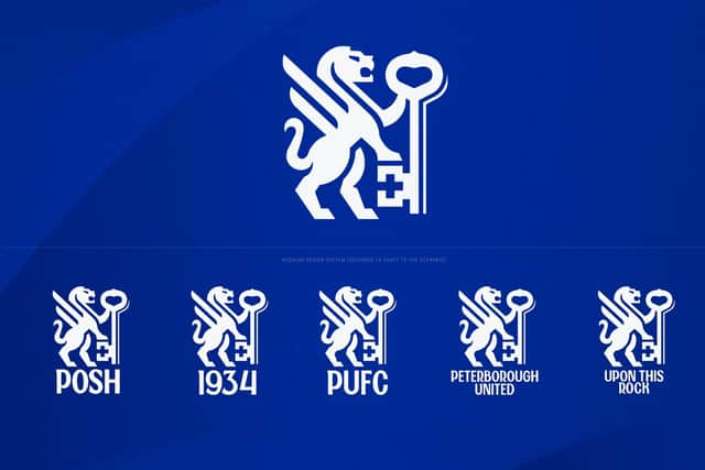

The club wheeled out some big hitters to try and justify the changes and pointed out the time, effort, and the logic, that led to a design that has been branded a ‘knock-off’ of Chelsea in some quarters.
Here is the reaction from fans on X in response to a request for comment from @PTAlanSwann…
I’ll await to see the branding in a badge form before making too much of a judgement. Having said that, my initial thoughts are it is absolutely awful and way too much like Chelsea – @poshpig3008
Oh dear. Subjective of course but I think that is awful – @Dazzabellamy
I really wouldn't know that was Posh's crest just by sight – @Jm79Steve
Definitely needs ‘PUFC’ or ‘The Posh’ under the badge. It could be worse, but it could be far, far better. A vote by the fans on a small number of different designs would have been a better solution – @PaulPosh
Not a fan as the old badge worked and is better anyway. Don’t get why we changed something that wasn’t broken – @Alexnelson2004
Give us our crossed keys back! – @eamonnduff
The more I look at it the more it's growing on me. Definitely would prefer to keep ‘Posh’ underneath. Glad they have highlighted the history of the club and incorporated it into the design. If it helps the club move forward I'm all for it – @OHarneiss
If this is to improve identity how would anyone not interested in Peterborough United know what this is? – @alanposh
Like it. Trust the process it's been through and allow time to see if it's validated commercially – @SidDay1
It ticks the box in terms of simplicity for branding. My biggest issue is focusing so heavily on the keys only to not have them cross. It's the crossing of the keys that is synonymous with St Peter and stacking them doesn't work for me - @ChrisHurst2
It’s not as bad as I thought it was going to be, but then again my expectations were quite low. Maybe in 50 years time it’ll be synonymous with Peterborough United. Looking at it this morning it could really be anybody – @JamesGWesley
I can’t believe people have been paid to come up with that. Looks like the badge has been created on Microsoft paint. Not sure how that screams out Peterborough at all – @nathwicks85
Inspiration more than imagination used here. City keys are always crossed, but modernising for the future is not a bad thing. I’m sure it wasn’t all on the designers. It would have been a selection panel to decide it, so it’ll need time from the fans – @Robbo10SR
Embarrassing. If someone sees that they wouldn't know its anything to do with Peterborough. And you won’t convince me otherwise. Im gutted. How can I buy a shirt with that on? – @richard_pufc86
Very good. Simple, fresh, meaningful and modern – @scarboroughsss
Nice crest that new fresh look – @bumblesixteen
There's no dressing it up. It is lazy – @LuminolSkyline
Gets 1 out of 10 from me. Utter garbage and it’s not going to grow on me. Might have to collect a few old mugs etc as this one isn’t getting bought when it appears – @ChestneyS
Not a patch on what we currently have, but fair play if it makes the club more money and revenue and fair play to the guy who makes a fortune designing these badges! – @davidwh1971
Shocking Chelsea knock off – @14Obrien141
It won't help the club make money and it looks like Chelsea in reverse – @CrispLevi
Horrible, but will save me a fortune on buying merchandise – @poshbluearmy