
Peterborough United have unveiled their new club crest as identity rebranding gathers pace
Peterborough United have unveiled their new club crest as part of an identity rebranding.
The club says the new crest is a move towards a more practical and functional identity, more suitable to a digital age, and one that will attract both current supporters and new demographics.
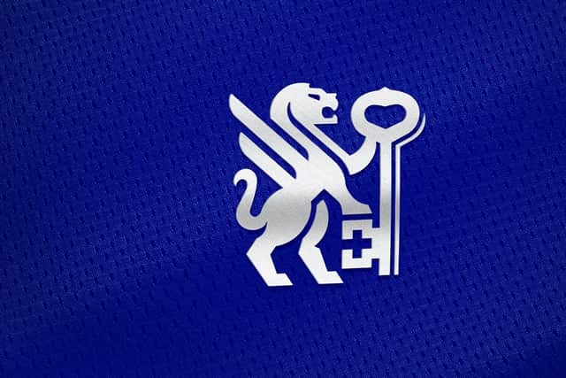

The owners and leadership team view this as a significant step forward in the football club's progression while acknowledging the importance of history, heritage, and storytelling in shaping its identity. Posh owner and chairman Darragh MacAnthony said, “We have to evolve, and branding is a massive part of that. I look at the big clubs and see how they are evolving, we have to modernise and we have to move with the times.
“I was sceptical about the whole project at first, but having seen the journey that we have been on, and how we have involved supporters, it just makes sense. We are evolving in our commercial department, we are evolving on the pitch and in the boardroom, and so our brand has to evolve. When I first saw it, it blew me away. I love it! I am really excited by it all."

The club have explained the new design which will be used exclusively on all kit and merchandise from June 2026 onwards. ‘The winged lions featured on our current badge are reimagined, with a single-winged lion depicted facing forward and holding the City’s keys aloft. The keys of Peterborough remain. They are featured on the city’s coat of arms and in our current identity. They can be seen prominently in and around Peterborough and are displayed on the club’s new identity, held aloft by the winged lion.
Working with football club identity designer Christopher Payne the club conducted a thorough and transparent process
In a survey, fans said the club is the heartbeat of Peterborough. This aligns with the CEO's vision of being a club in the heart of the community. This sentiment and ambition are reflected in the handle of the key, where you will find the heart.’
Posh chief executive officer Dawn Gore added: “The football industry is evolving and from the training ground to the boardroom, we are raising standards and continuing to strive for excellence in all that we do. "The brand redesign is one part of our growth plan. It has never been about changing who we are, it’s about updating our identity and future proofing. "From the outset we wanted to listen to fans and overwhelmingly, they wanted to honour our history. With Chris Payne’s passion, creativity, expertise and unwavering commitment in guiding us through the process, I am delighted we have captured the past and also built for the future.”

Posh are also introducing our new custom-designed typeface - Posh Type. Also designed by Christopher Payne, it will be used across all club identities and communications.
Posh have also created a series of sub-identities initially including ‘wordmark’, ‘motto (‘upon this rock’). ‘pride in Posh’, ‘heritage’, ‘triumph’ and ‘mascot’.