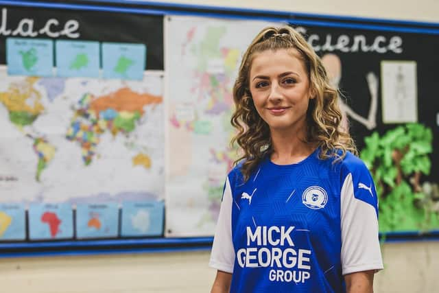
Peterborough United sales ‘phenomenal’ already as fans react to new home shirt: ‘It’s great, it’s meh, it’s a promotion-winning shirt, it’s an Ipswich Town shirt, it’s warrior-like, it’s gorgeous, it’s naff’


The fans’ initial reactions were generally positive on social media last night (July 5).
Here are a selection of comments as told to @PTAlanSwann and @DMac102 on Twitter...
Advertisement
Hide AdAdvertisement
Hide AdIt looks great and the online pictures didn’t do it justice as the material detailing is very nice. I haven’t bought one for about 4 years as they started to just be off-the-rail products. This is however bespoke, or so I’m being told. I’ve actually ordered one.
@ChestneyS
Need to see it for real, but personally prefer a darker blue and, showing my age here, I like a shirt to have a collar!
@davidwh1971
Refreshingly different for a Posh home shirt - only so much you can do with a predominately blue one.
@hollyman07
Take the Mick George sponsorship off and it’s a throwback to the 50s and 60s.
@john6anderson
Ipswich Town was the first thing that came to mind.
@Deedz42
It’s a promotion-winning shirt.
@RealJohn Evo
Advertisement
Hide AdAdvertisement
Hide AdLooks great! Let’s hope it becomes iconic after destroying the league next season.
@philbeck1981
A lot better than the Nike kits.
@davidrbull2010
It’s lovely, nicest home shirt in a long time! Hopefully they dont mess up the away kits like they did with Man City’s this season.
@ashleyrodgers21
Very nice. Still fairly simple, but definitely a lot more thought went into it compared to the last 2/3 kits. First shirt purchase in a few seasons.
@_liamchambers
It’s awful. The mound of dirt they modelled it in front of looks better.
@hhxwarth
Advertisement
Hide AdAdvertisement
Hide AdBest home kit for some time. They have done a good job on it.
@RayEllis17
I think it is a good effort from Puma. I am pleased they have gone with white sleeves too. Slightly disappointed the Posh logo is heat transferred, as opposed to embroidered, but sign of the times I suppose.
@adamgreen86
Who actually cares as long as it’s blue?
@CrispLevi
Meh they could have done better. It’s hardly bespoke.
@140brien14
It does look nice, but I can’t afford one as I am moving to university this September and need to save up funds so I can enjoy my time there. I like the hexagonal design on the blue shirt as it makes the shirt seem sturdy and almost warrior like!
@EspieJaz
Love it!
@RoyHouldershaw
Bold statement, but could be one of my favourite kits since I started supporting the club. Wow!
@WeAreThePosh
HELLO GORGEOUS!
@missposhjw
Advertisement
Hide AdAdvertisement
Hide AdAfter moving up to Peterborough 3 years ago, I finally got to some games last year, loved it, love the vibe around the club. Easy decision to part with some cash to support the club and purchase the new shirt.
@S87Leon
I don’t like the cube pattern, white sleeves or white flecks. I think it’s too 90’s looking, which some will find ‘retro’, but I think it’s a bit naff. Kits look better in a solid colour for me.
@steverodz
RELATED: Order you new shirt here: https://www.peterboroughtoday.co.uk/sport/football/peterborough-united/peterborough-united-unveil-their-home-kit-2020-21-season-2904068